Circulation Drive
A native mobile app to help Logisticare|Circulation transportation providers service and bill for member rides

Project Brief
LogistiCare|Circulation is the nation’s largest manager of non-emergency medical transportation (NEMT) programs for state government agencies and managed care organizations. The company provides NEMT ride management, call center management, transportation provider network development and credentialing, and vendor administration. The goal of which is to provide access to convenient, cost-effective, safe and reliable transportation. This last year the UX team was tasked with designing a native mobile app to better help the company’s transportation providers service and bill for the rides that they handle. Until this point the company only offered a responsive web portal for drivers.
My Role
I worked in collaboration with a user experience researcher and product manager over the course of seven months through discovery, design iteration, and development. I was solely responsible for all wireframes, high-fidelity mockups, visual design, prototyping, and interaction design. I supported user research in helping to craft questionnaires, testing protocols, and surveys as well as facilitating user interviews and testing. Additionally I helped with QA testing while the final product was in development.

Contextual Analysis
Contextual Inquiries provide rich, holistic insights into people’s views and actions as well as the environment through observations. The UX team participated in ride alongs with three of our transportation providers in Massachusetts. The team was able to take rides with 5 different drivers across these 3 companies. The goal of which was to understand:
How these drivers interacted with the different APIs that they use to service rides
How these different apps are working for them
What issues they are currently experiencing
Identify areas for innovation
Key findings from these ride alongs were:
Many rides are denied payment due to GPS issues associated with ride tracking.
Rural and urban transportation providers dispatch rides differently. Rural providers tend to schedule a whole day of rides for a driver in advance, while urban providers tend to assign one ride at a time to their drivers.
Communication is constant between dispatch and driver. Methods varied between radios and cell phones.
When using the Circulation website on mobile phones drivers were logged off of the platform frequently which caused frustration.
Riders communicated the need for notifications when schedules changed.
Drivers wanted more control of how they ordered rides within their queues.
Using the ride alongs as a model, we began working through task analysis and potential work flows. These flow diagrams also helped us to see where we might be able to introduce new features.
User Interviews And Design Thinking Session
A Design Thinking Workshop brings together key stakeholders to understand the users’ needs and brainstorm creative solutions. Typically, a Design Thinking Workshop is divided into five unique steps: empathize, define, ideate, prototype, test. For this workshop the collaborative team focused on empathy, define, and ideate. The members of the workshop included representatives from our transportation companies, the UX team, VP of Product, VP of Engineering, customer service representatives, and members of our network implementation team.
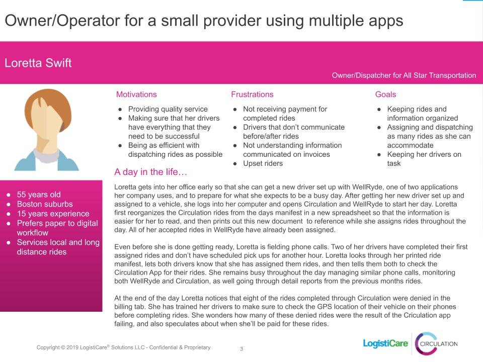
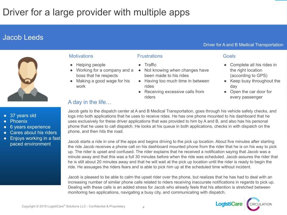
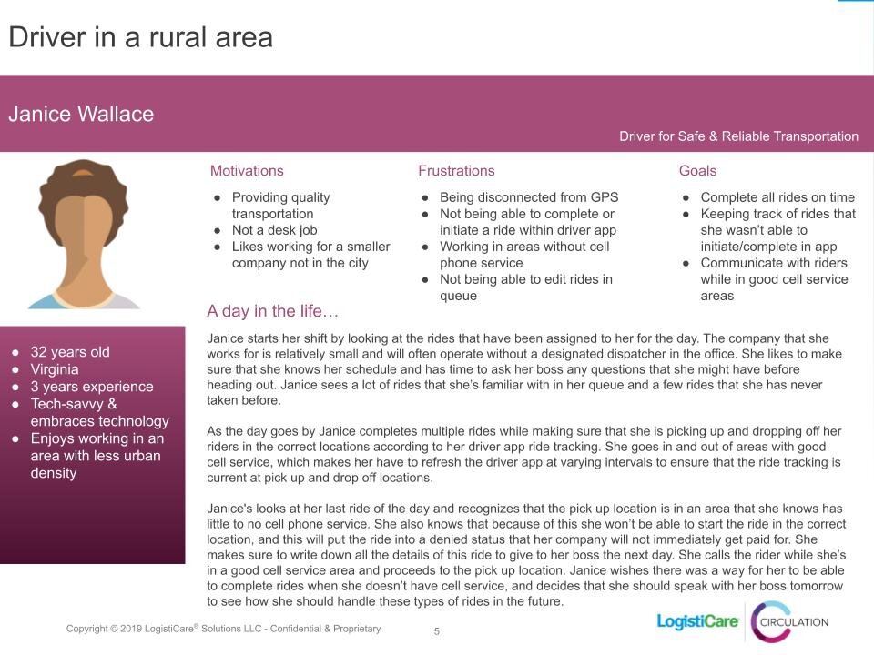
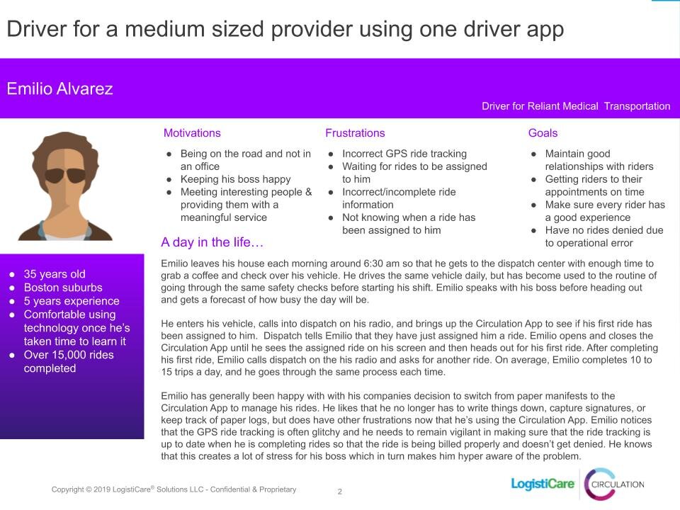
The UX team began by presenting data from a use survey that was previously disseminated amongst a number of our transportation providers. The survey asked participants to rate 26 questions on a 7 point Likert Scale. The survey and follow up interviews offered a window into the negative and positive aspects that drivers felt about using Circulation. After discussing these findings we asked the workshop to help identify the different types of users that would potentially use Circulation Drive. We used this discussion to produce the four personas below.
Insights from the interviews and surveys were then used for affinity mapping ...
Which lead directly to feature prioritization.
After identifying the desired improvements and features that we would want to have in Circulation Drive, we consulted with our VP of Engineering and began feature prioritization based upon what we believed we could produce in the allotted time for an MVP. After prioritization we decided to focus on the following features:
Out of app push notifications
Notify drivers of schedule changes and cancellations
Provide access to a driver’s complete daily schedule
Provide drivers access to a list of past trips (completed, cancelled, incomplete)
Let driver add notes to a trip
Capture electronic signatures from riders
Provide a way to multi-load passengers
Allow drivers to customize ride order with drag and drop
Design And Iteration
After identifying features that we felt were necessary for our app, I began sketching. After finalizing flows and consulting with the product manager about designs I worked with our researcher to draft testing protocols. I produced the prototype and we were able to recruit eight participants for testing. The participants were comprised of internal LogistiCare|Circulation employees, transportation providers, and network implementation teams. The participants completed six different scenarios:
Logging in and requesting more rides
Completing a single Pick Up and Drop Off
Multi-loading riders and dropping them off at two different locations
Receiving a cancellation en-route to a Pick Up location
Cancelling a trip at the door
Cancelling a trip for a rider no-show
Listed below are the design iterations based upon the feedback from testing:
Participants liked the information displayed on the landing page. They thought it would be useful for drivers to have a snapshot of their driving stats for the day and quick access to their daily schedule. Unfortunately the weather widget and driving stats were too heavy of a technical lift for MVP, but may be introduced in a future state. Two participants suggested adding in the next trip the driver will be taking on the home page so they know at a glance how long until their next trip begins. Participants from our network implementation team suggested the need to display which user was logged into the app in the slide up drawer. This was an important addition because larger transportation companies sometimes have multiple drivers using the same device across shifts.
All participants expressed confusion about having an item for the driver to action for a Pick Up (PU) and then a second item to action for a Drop Off (DO) for a single ride. Many did not understand the abbreviations for PU and DO and some had trouble knowing which ride to action on after completing a Pick Up. Through the course of the additional scenarios, participants read and pieced together why there were two items for a single ride. This suggests that with training, the concept is learnable. Final designs offered better legibility for participants in understanding Pick Ups, Drop Offs, and associated ride cards. An icon was also added to the ride cards to indicate they were moveable, a feature that wasn’t evident to most testers.
Overall, participants felt that there were too many steps to complete a single trip since the PU and the DO were separated for a single ride. Most were confused when the app did not auto-progress from the PU to the DO. In the final iterations we provide a way for the driver to advance from completing the PU to starting the DO without returning to “My Rides”. This helped to eliminate steps and keep advancing the ride.
Participants wanted more information about which trip wasn’t completed. Participants expected to see the name of the person and high-level ride information (e.g. Ride 1 PU for <name>) on the “forgot to complete ride” message. They wanted to make sure they were completing/choosing to not complete a ride for the correct rider. Participants also expressed confusion around the content of the notification for an initiated Will Call. High level information including rider name and Pick Up time were added. Push notifications were identified as being necessary by multiple transportation providers as most drivers use navigation apps outside of the dispatch software that they use.
After designs were finalized, development and QA testing began. Below is a video of an early beta of the app in development.
After some QA testing it was apparent that the signature capture transition from portrait to landscape was abrupt. I developed a transitional video in After Effects and exported the JSON code for FE engineering to implement in the signature flow. The video can be seen below.
In beta testing it also became apparent that there was a need for a short onboarding tutorial for first time log in. Testers were not able to begin using the app because we were not asking for the appropriate information at the onset, but were rather relying on the user to input the proper information on their own.

Loading screen and short onboarding tutorial.
Outcome
As a team and company we were able to get an MVP to market that addresses the needs of our drivers. The constraints of time and workload somewhat limited the scope of our work. The product has been well received, but given more time I would like to develop some features that would be a value add in the future. Namely:
In app navigation
A more interactive home screen
Weather widget
Driver Stats
Improve upon the multi-loading workflow